
In this story
There is no natural top of the Earth
On a globe, no direction is inherently above another. “Up” and “down” are determined by gravity near a person’s location, not by the planet’s north and south poles. A flat map therefore has to make a choice about orientation before it can show the world on a page.
Cartographers could place north at the top, south at the top, or even turn the map so that a particular road, coastline or journey runs vertically. The direction at the top is a design decision that helps readers understand the map; it is not a physical property of the landscape.
Modern maps commonly use north at the top because readers have become accustomed to the arrangement. Once a large community shares the same convention, maps become quicker to read: the upper part of a map means north, the lower part means south, and a location in the upper-left is understood to be north-west of the centre.
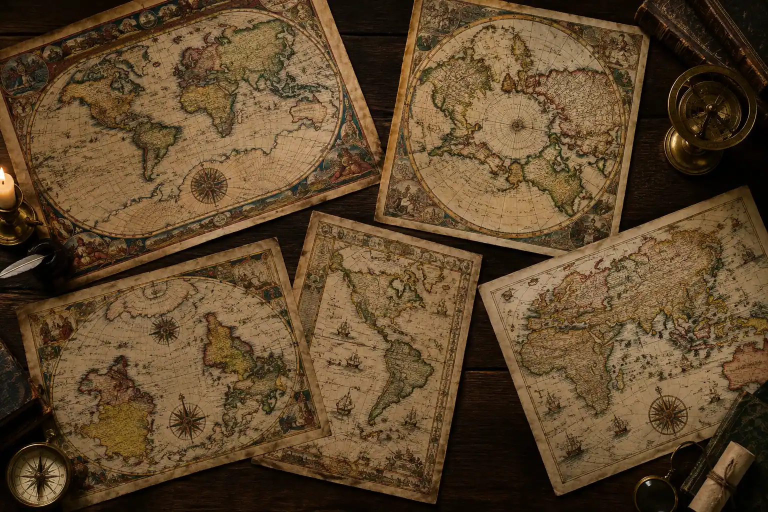
Older maps did not agree about which way was up
The word “orientation” is connected with the east, the direction of sunrise. In earlier European traditions, maps were often made with east at the top. This gave the east a special symbolic importance and placed Jerusalem or other religious locations prominently in some medieval world maps.
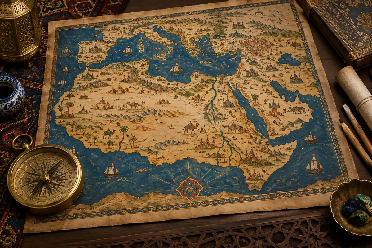
Other societies used different arrangements for practical or cultural reasons. The Library of Congress describes the world maps associated with the medieval geographer al-Idrisi as having south at the top and Mecca near the centre. In China, maps and landscape images could also use arrangements that did not match the modern north-up convention.
These examples matter because they show that north-up was not the only sensible way to depict the world. A map reflects the priorities of its maker: the direction of travel, the location of a sacred place, the political centre, the shape of the page, or the information the map is meant to communicate.
Some historical maps also used a viewpoint rather than a compass direction. A map could be imagined as a person looking towards a landscape, with nearby places at the bottom and distant places at the top. In that system, visual perspective was more important than keeping north in a fixed position.
The compass helped make north useful
Magnetic compasses gave navigators a reliable way to identify a north–south direction, although a compass points towards magnetic north rather than the exact geographic North Pole. European navigators increasingly used compass directions between the medieval and early modern periods, making orientation by the cardinal points more useful in practical mapmaking.
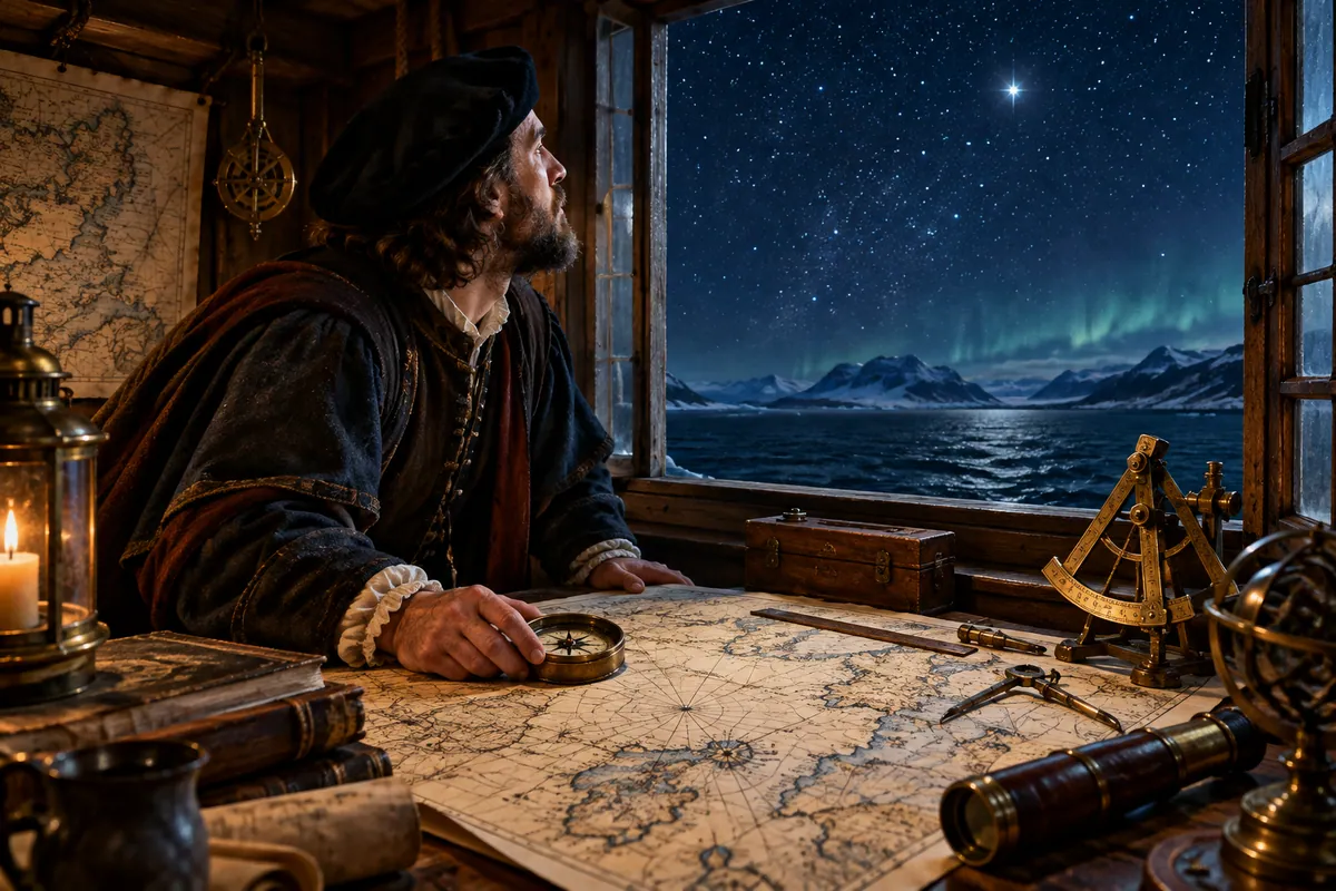
The North Star also offered a visible reference for travellers in the Northern Hemisphere. It appears close to the north celestial pole, so it can help indicate north at night. The combination of the North Star, the compass and growing knowledge of latitude made north a particularly useful organising direction for European navigation.
This does not mean that the compass single-handedly created the modern convention. Historical sources point to several overlapping influences, and scholars cannot reduce the change to one invention or one date. North-up developed gradually as mapmakers, navigators and publishers adopted arrangements that made their maps easier to compare and use.
The convention also suited the location of much of the mapmaking industry that became globally influential. European explorers, surveyors and printers produced maps for navigation, trade, administration and education. Their map designs were copied, printed, taught and eventually treated as standard.
Printing turned a habit into a standard
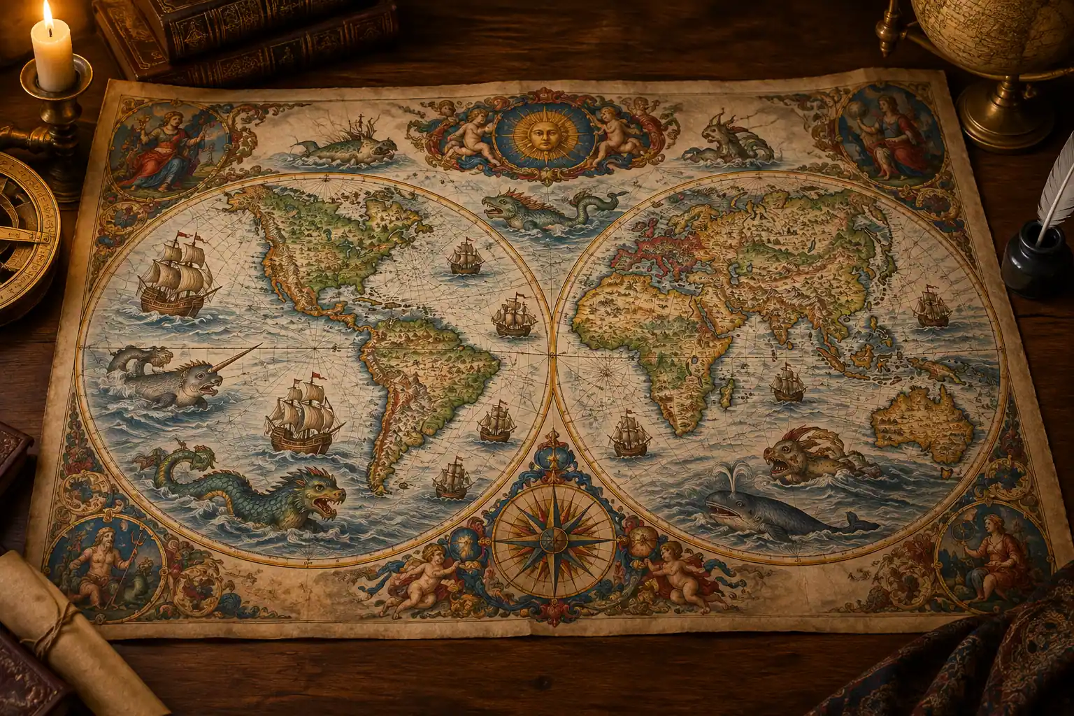
A convention becomes powerful when it is repeated. Before printed maps were widely available, a map’s orientation could be understood within the culture or purpose for which it was made. As printing and commercial map publishing expanded, a consistent layout became more valuable to people who were comparing different maps.
The rediscovery and printing of geographical works associated with the ancient Greek geographer Claudius Ptolemy also helped shape European mapmaking. Ptolemy’s work supplied a coordinate-based framework for placing locations, even though many of the longitudes and geographical details were inaccurate by modern standards. Later mapmakers adapted and corrected older geographical material while retaining familiar conventions.
By the early modern period, north-up maps were becoming increasingly common in European atlases and navigational materials. This was not simply because north was scientifically superior. It was also because map users, publishers and institutions had begun to expect it.
Once north-up maps dominated printed education, government surveys and commercial navigation, turning a map upside down could feel wrong even though the information remained geographically valid. Familiarity made the convention seem natural.
Does north at the top make the world look a certain way?
Yes. Map orientation can influence how people imagine the relative importance of places. The top of a page is often perceived as more prominent, so putting the Northern Hemisphere above the Southern Hemisphere can subtly make northern places seem visually dominant.
Map orientation is only one source of that effect. Projection, scale, the centre of the map, the amount of detail and the choice of labels also influence what viewers notice. A world map centred on Europe gives a different impression from one centred on the Pacific, even if both use north at the top.
This is why alternative world maps sometimes place south at the top or centre the map on a different ocean. Such maps are not geographically “wrong” merely because they look unfamiliar. If the orientation is clearly marked, the map can communicate the same locations while inviting readers to see the world from another viewpoint.
The famous photograph of Earth known as the “Blue Marble” is a useful reminder that even photographs can be rotated. The familiar presentation is a chosen orientation rather than the only correct way to display a spherical planet.
Why do digital maps often rotate?
Street maps and navigation apps frequently use a different convention from general world maps: the display may rotate so that the direction of travel is at the top. This is called a direction-of-travel or track-up orientation. It can make an upcoming turn easier to understand because the screen resembles the driver’s or walker’s immediate viewpoint.
Many applications allow users to switch between this mode and north-up mode. North-up is useful for maintaining a stable mental picture of an area, while track-up can be more intuitive when following a route. Neither mode is inherently more correct; they serve different tasks.
This practical choice echoes older mapmaking traditions. A traveller may find it easier to use a map aligned with the road or coastline than one fixed to a global compass direction. The purpose of a map often determines its orientation.
So when north appears at the top of a world map, it is best understood as a shared reading habit. It survives because it is familiar, convenient and deeply embedded in modern cartography—not because the planet has a top.
What to remember
- North is at the top of most modern maps by convention, not because north is naturally “up”.
- Older maps used east, south and other orientations for religious, cultural, practical or visual reasons.
- Compasses, the North Star, European navigation and the spread of printing all helped north-up become dominant.
- Map orientation can influence how viewers perceive the importance and position of different parts of the world.
- Digital maps may rotate to put the direction of travel at the top because that is useful for navigation.
Sources & further reading
Where this story comes from
- Al-Idrisi’s Masterpiece of Medieval GeographyLibrary of Congress
- Why maps are made: OrientationThe Open University
- Where Do I Begin? Reading Historical MapsGeorge Mason University, History Matters
- Why is North “Up” on Maps?University of California, Santa Barbara Geography
- Map Orientation and ShapeUniversity of Hawaiʻi at Mānoa
- Maps Question 2: OrientationGeorge Mason University, Center for History and New Media
- Perspective in Map MakingLibrary of Congress
This story was researched, drafted and illustrated with AI, then automatically checked against ANTB's structural and sourcing rules. Use the linked primary and institutional sources to verify important details.
 History · 5 min read
 History · 6 min read
 History · 6 min read